GIANT SKULL - Brand Identity
Art Direction & Brand Design — We Are Royale for Giant Skull, 2024
Role: Art Director & Lead Designer
Client: Giant Skull
Studio: We Are Royale
Tools: After Effects, Cinema 4D, Photoshop, Illustrator
Scope: Full brand identity — logo, typography, motion system, brand assets
Overview
Giant Skull isn't a typical game studio, and their brand couldn't be either. Founded by Stig Asmussen — director of God of War III and the Star Wars Jedi series — the studio wanted a brand identity that functioned like a game: layered, mysterious, and designed to reveal itself over time. As Art Director and lead designer at We Are Royale, I was responsible for every visual asset in the system, from the logo to the motion language to the interactive brand world.
Workflow
Strategy

Research
Market Analysis
Logo Development
Brand Development
Brand Animation
Brand Book
Month 1
Discovery
Month 2
Production
Month 3
The Concept
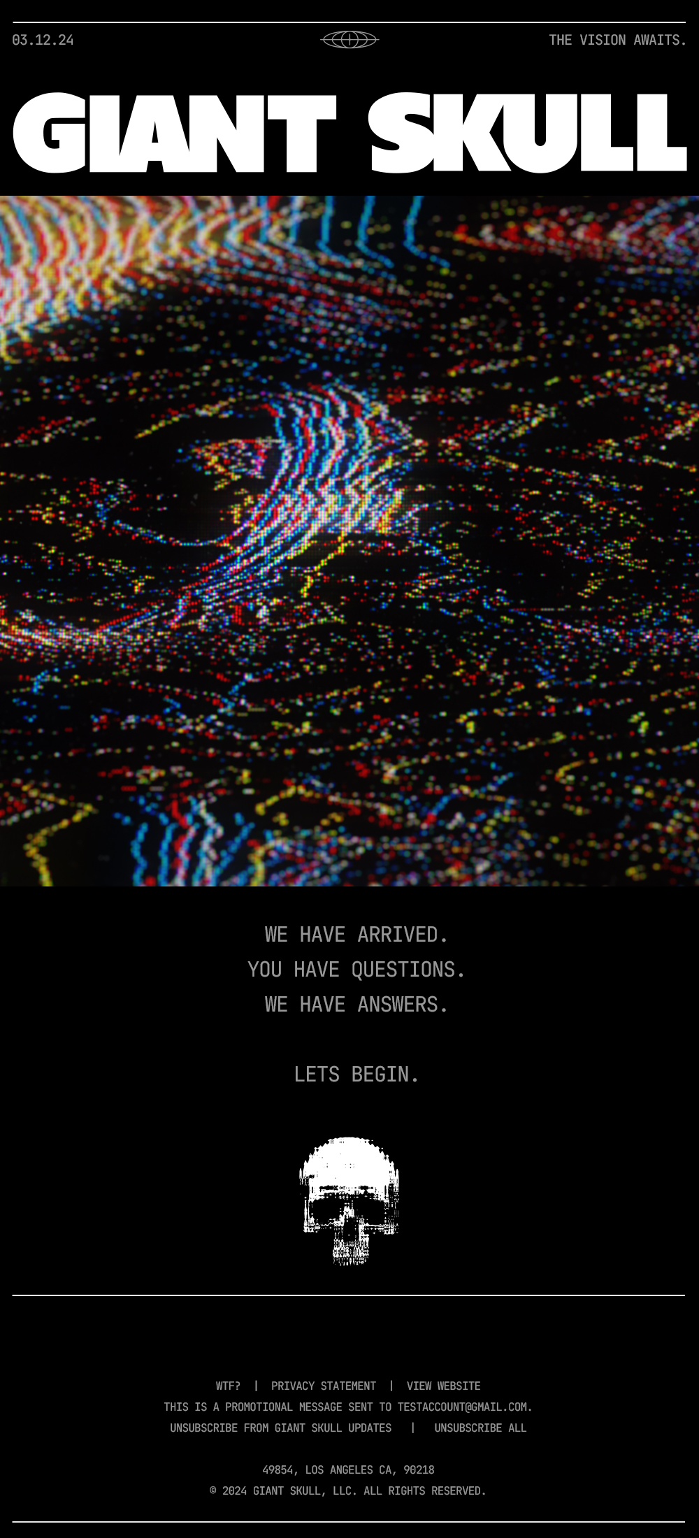
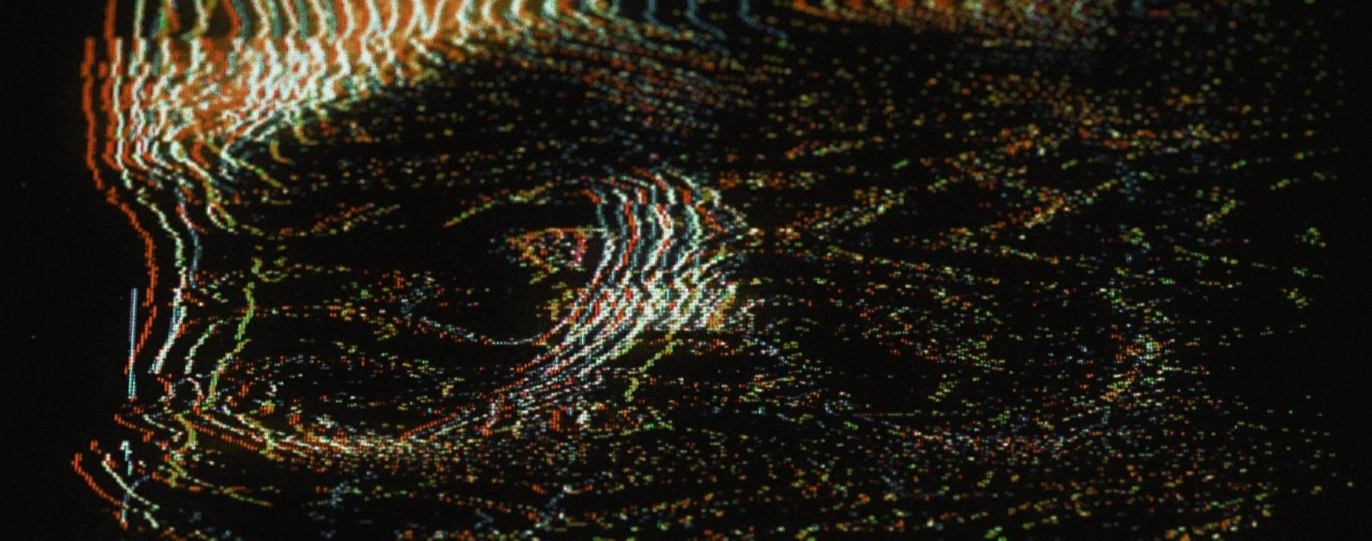
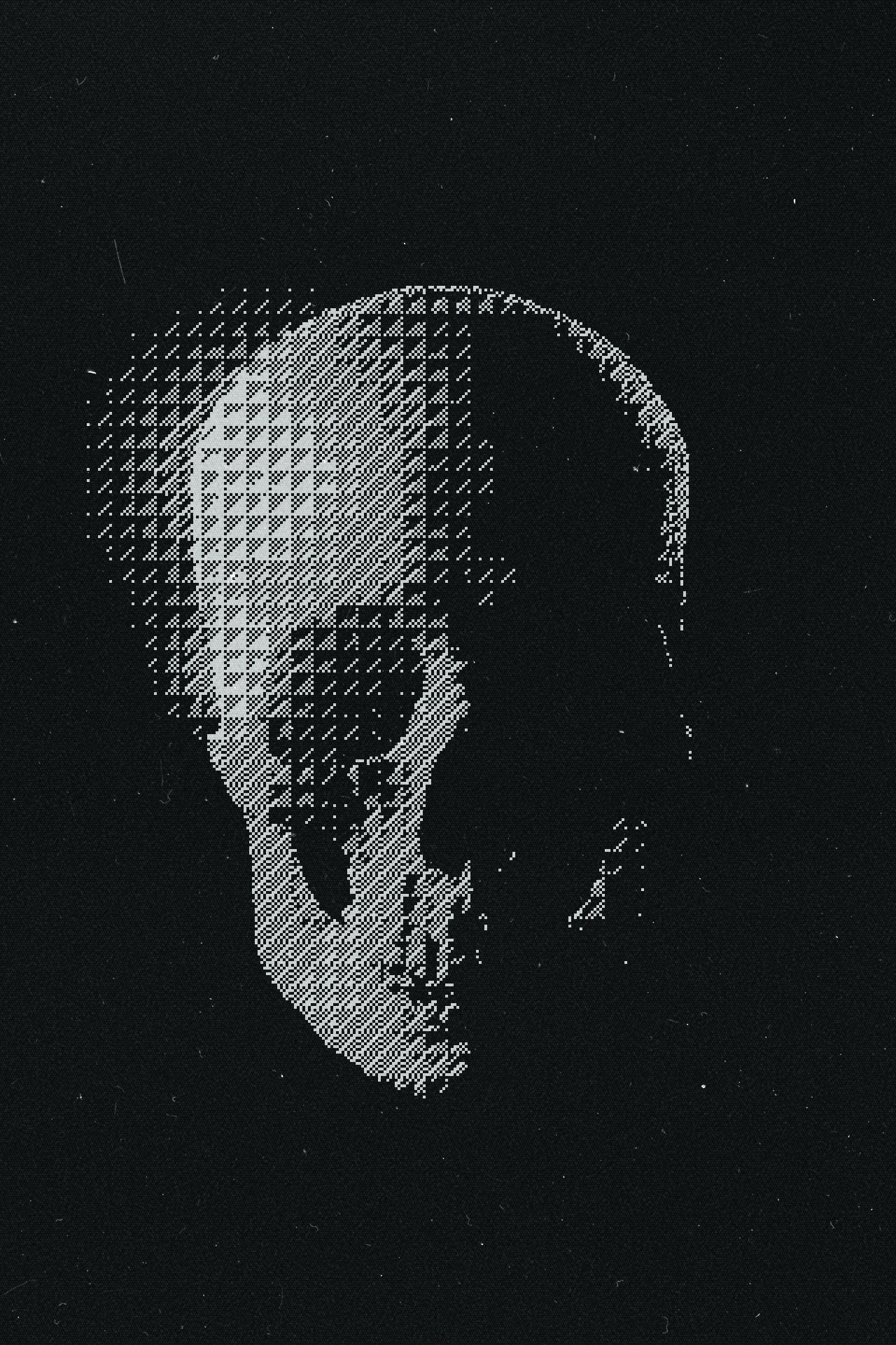
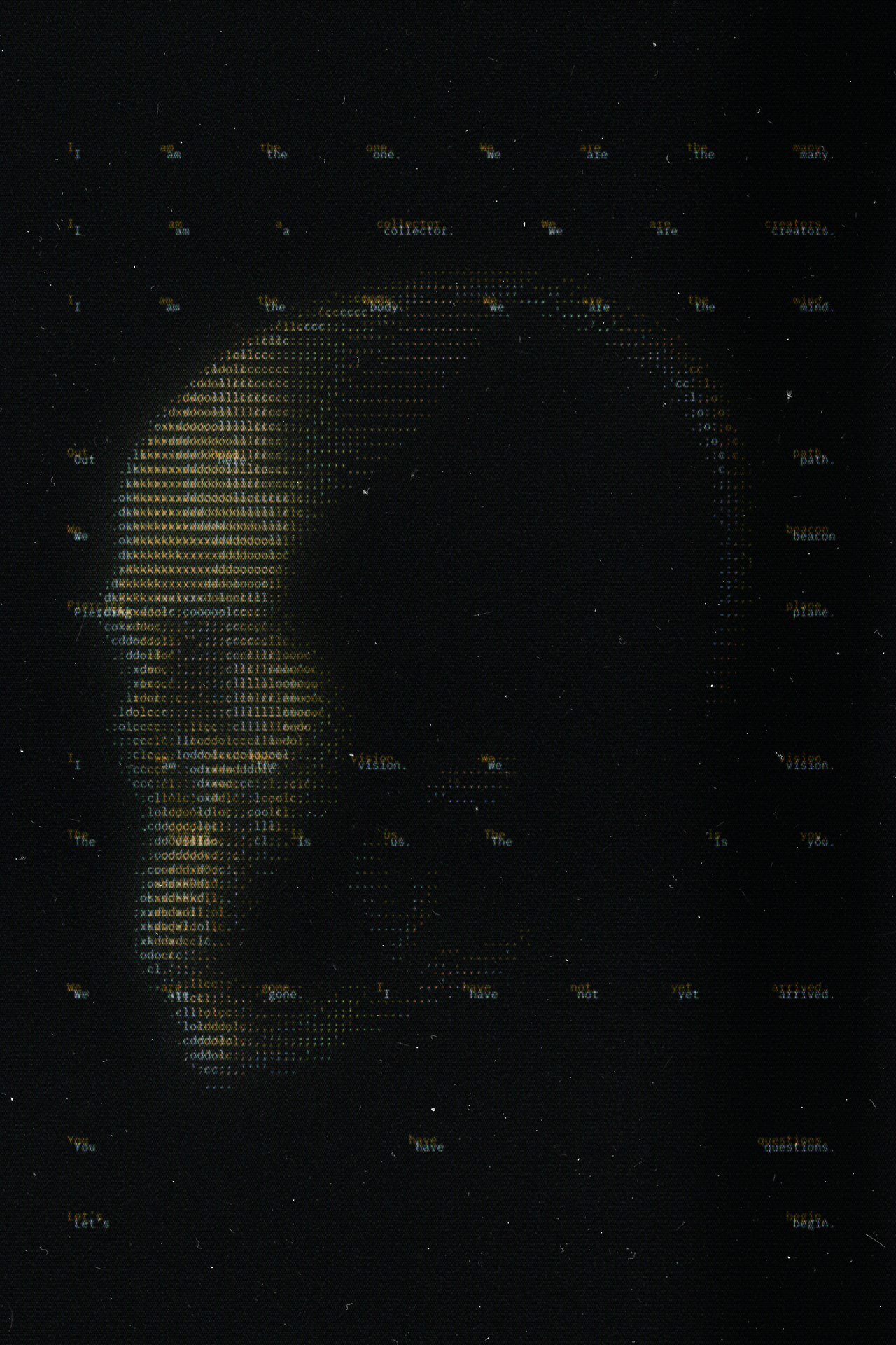
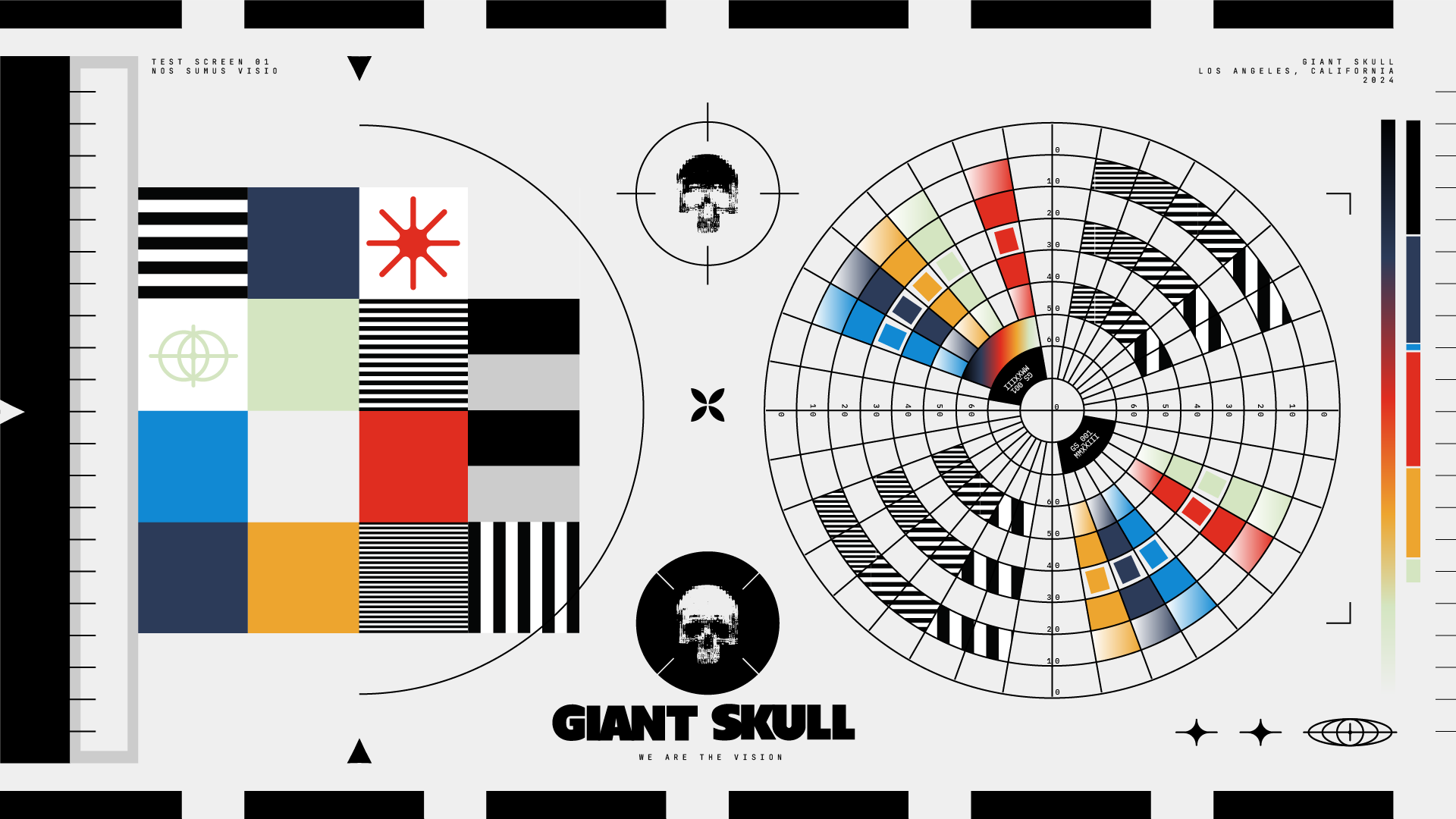
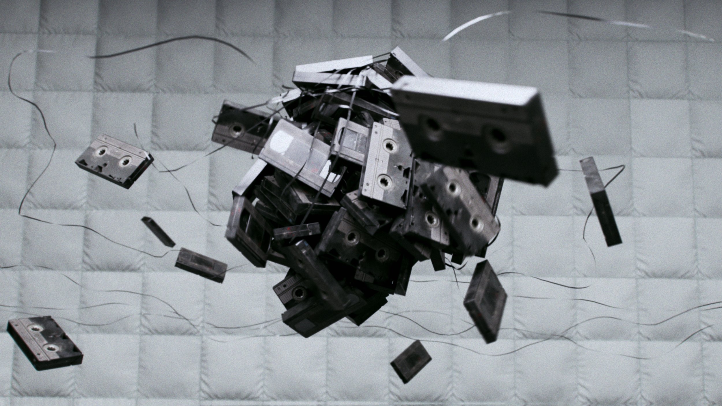
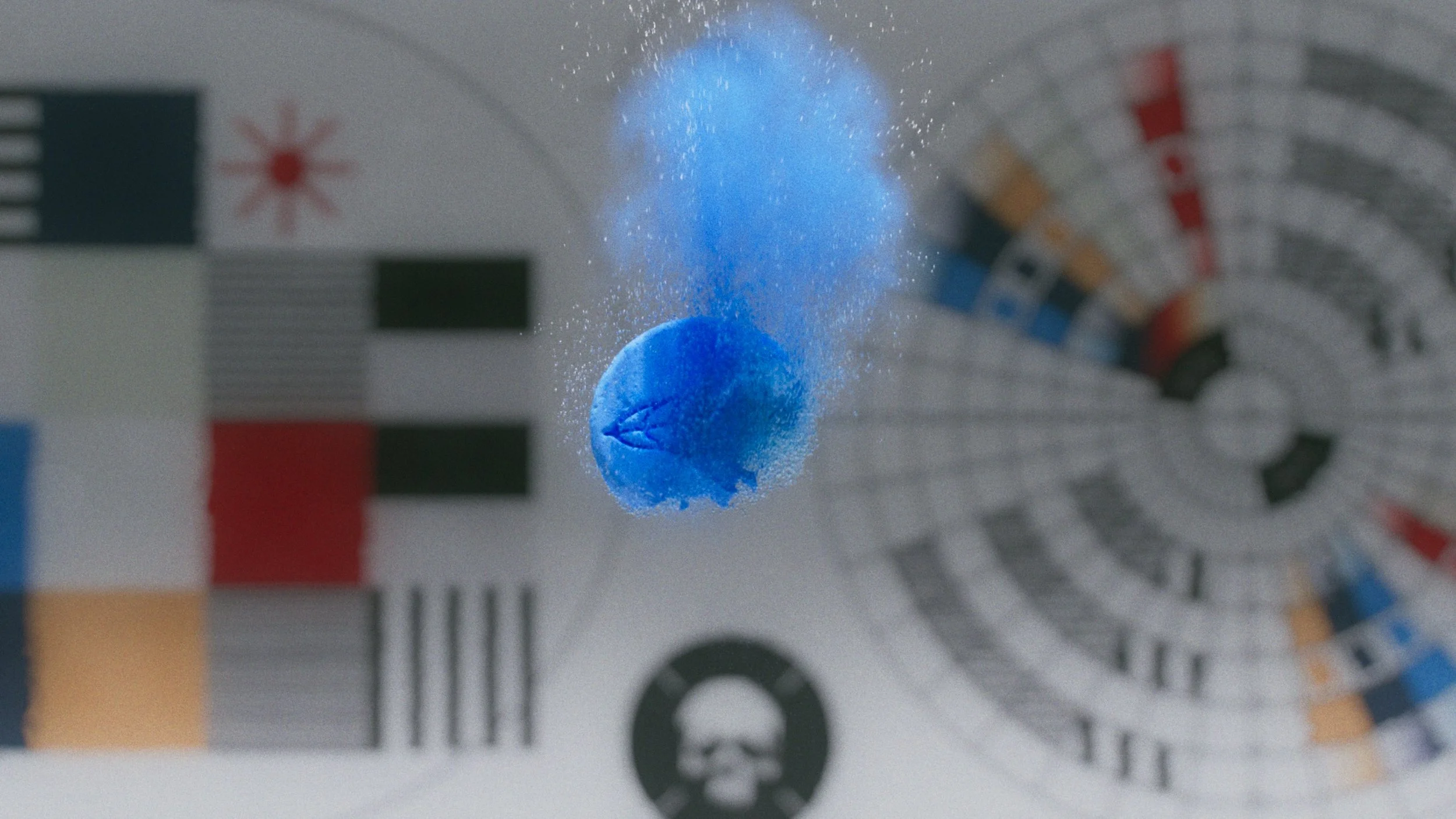
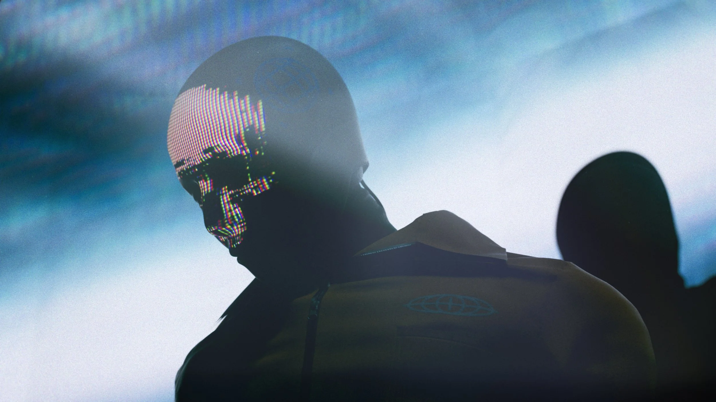
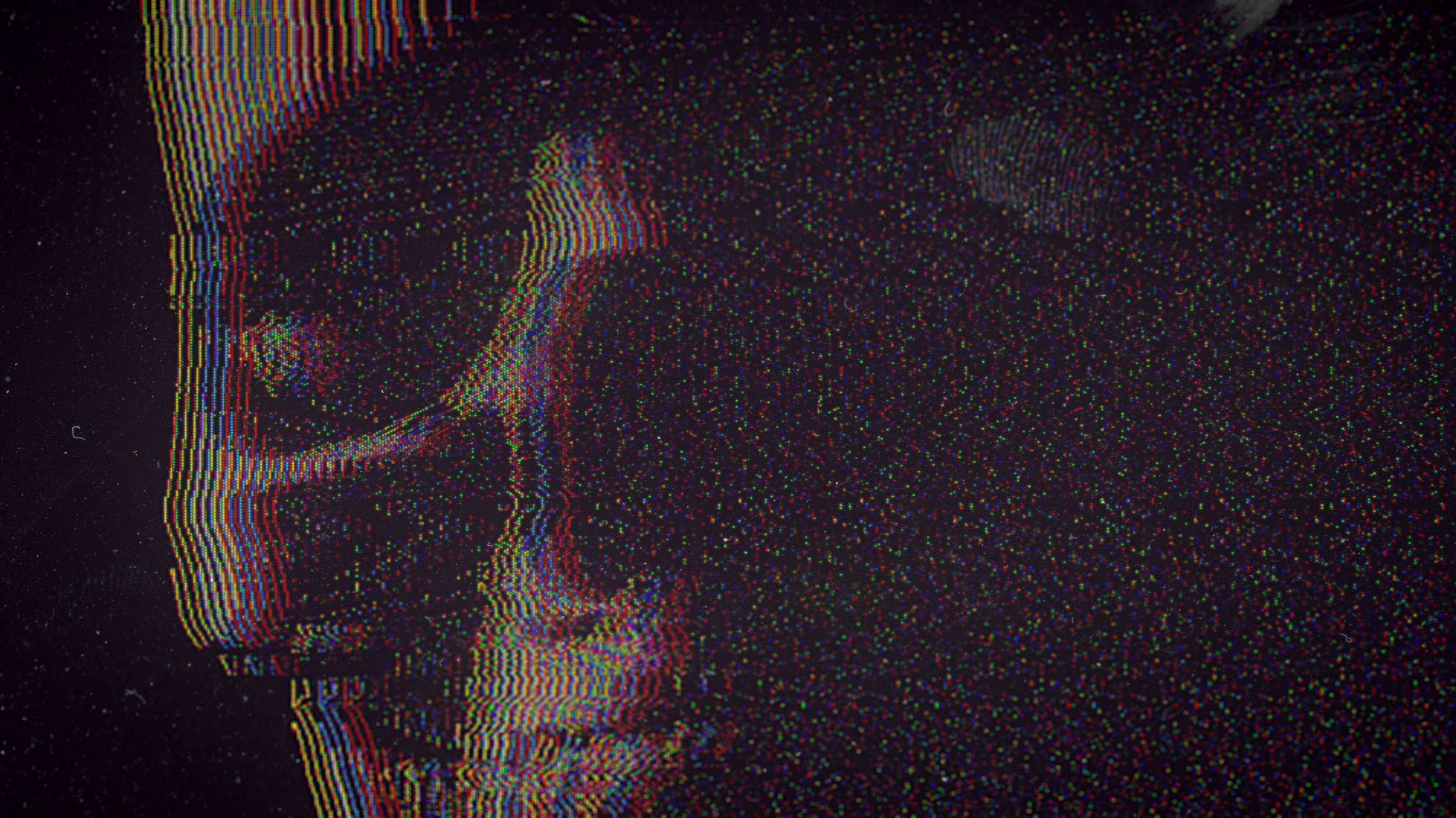
The brief was to build a brand that could grow alongside a game still being made. Rather than a static identity, we designed a living system one where the logo itself contains a world. At small scale it reads as a skull. Zoomed in, it dissolves into a dense tapestry of glyphs, fragments, and distorted icons that hint at the game universe forming beneath the surface. The brand rewards curiosity, which is exactly what the studio is about.


Logomark

Wordmark
Display / Logo Font

Boldstrom
Detail Font

Jetbrains Mono
Icons
Process
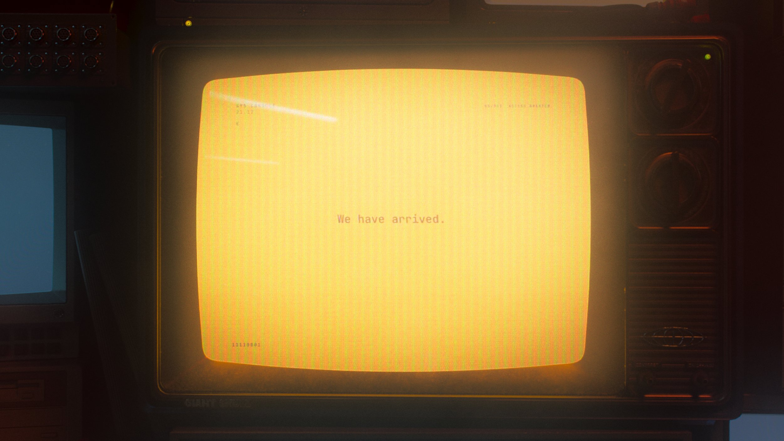
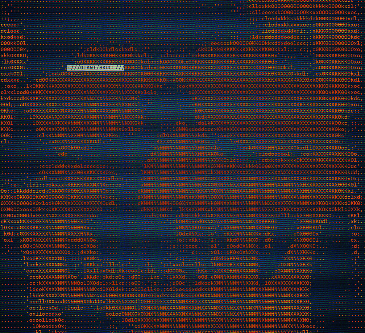
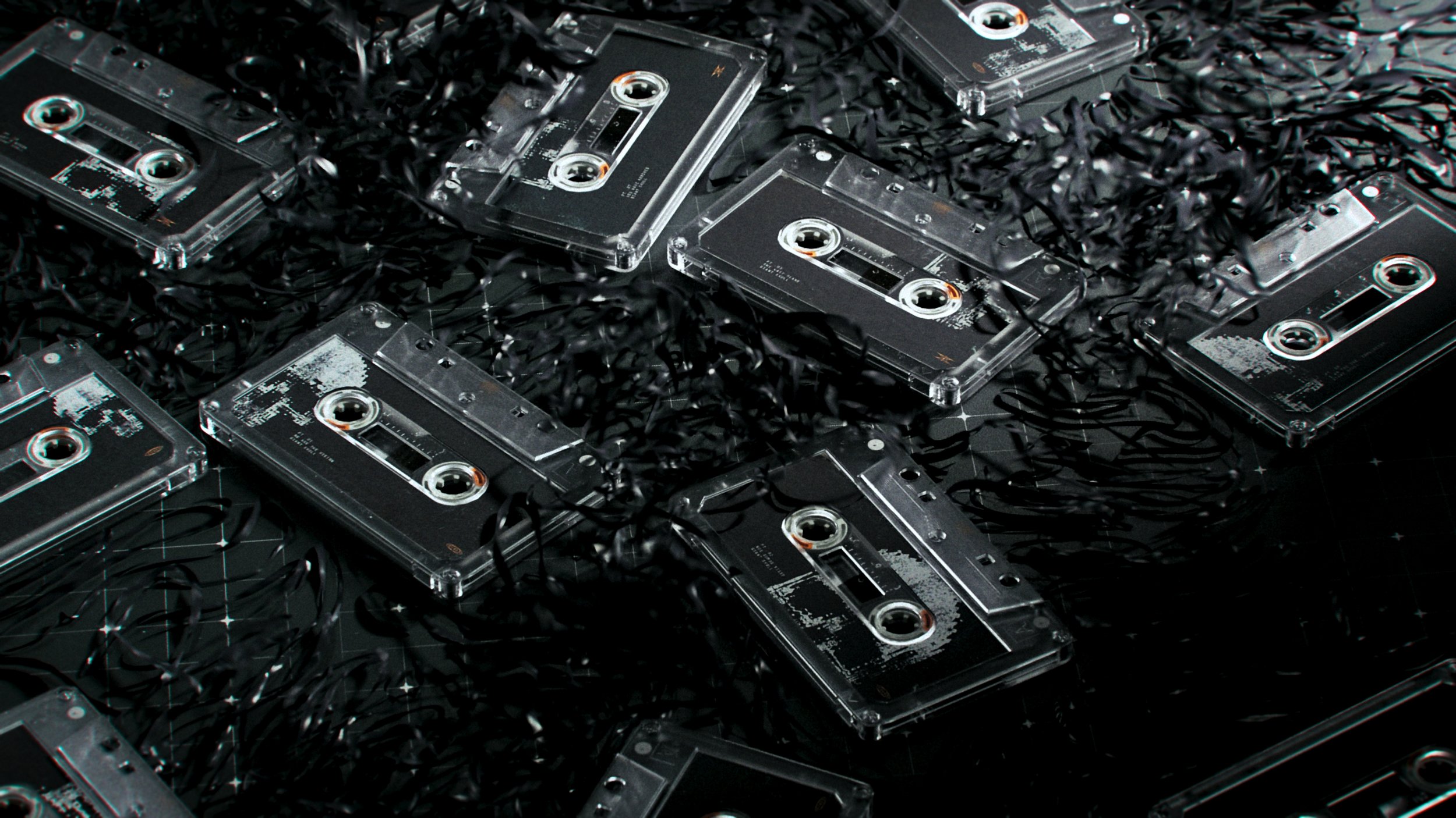
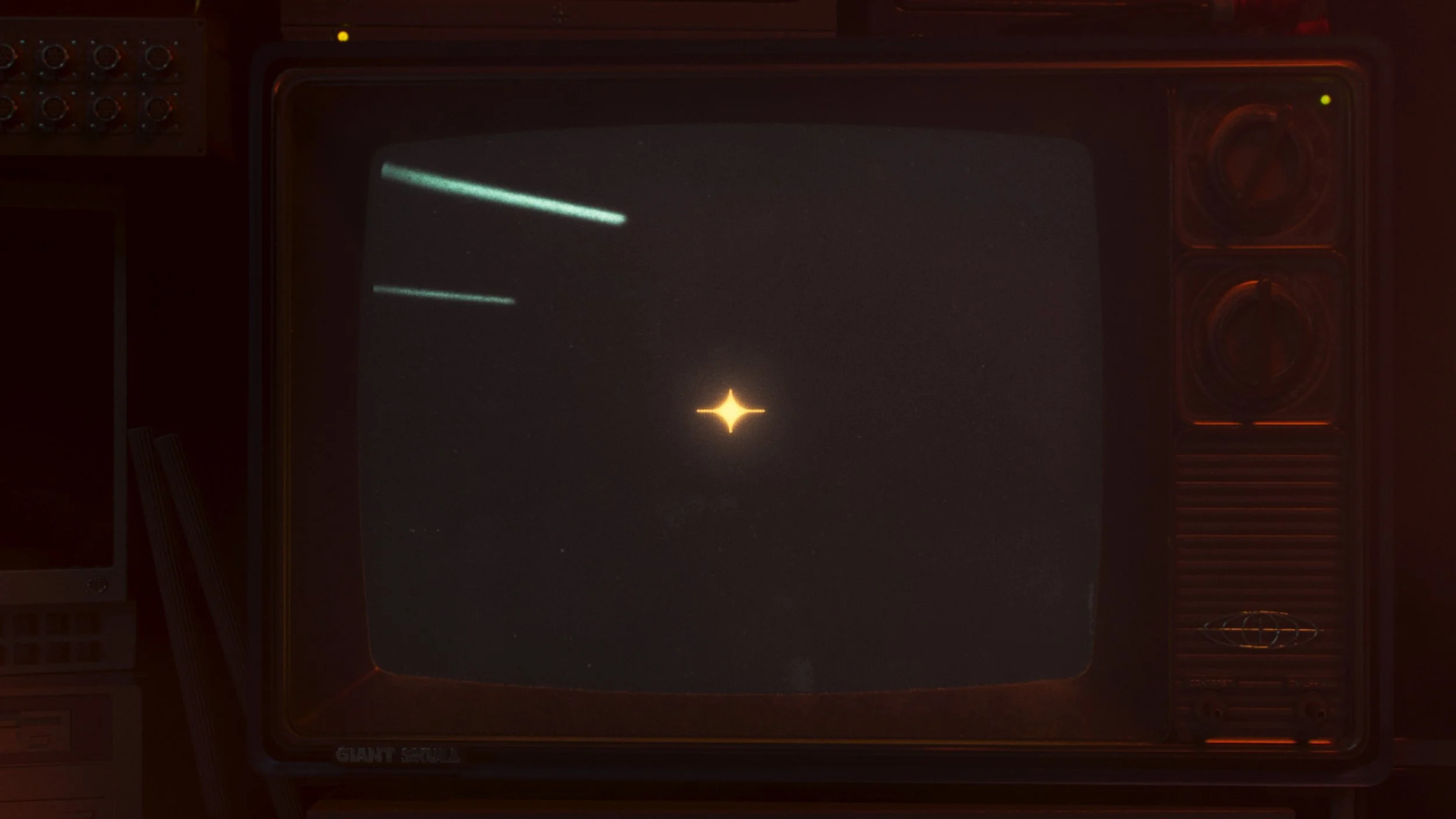
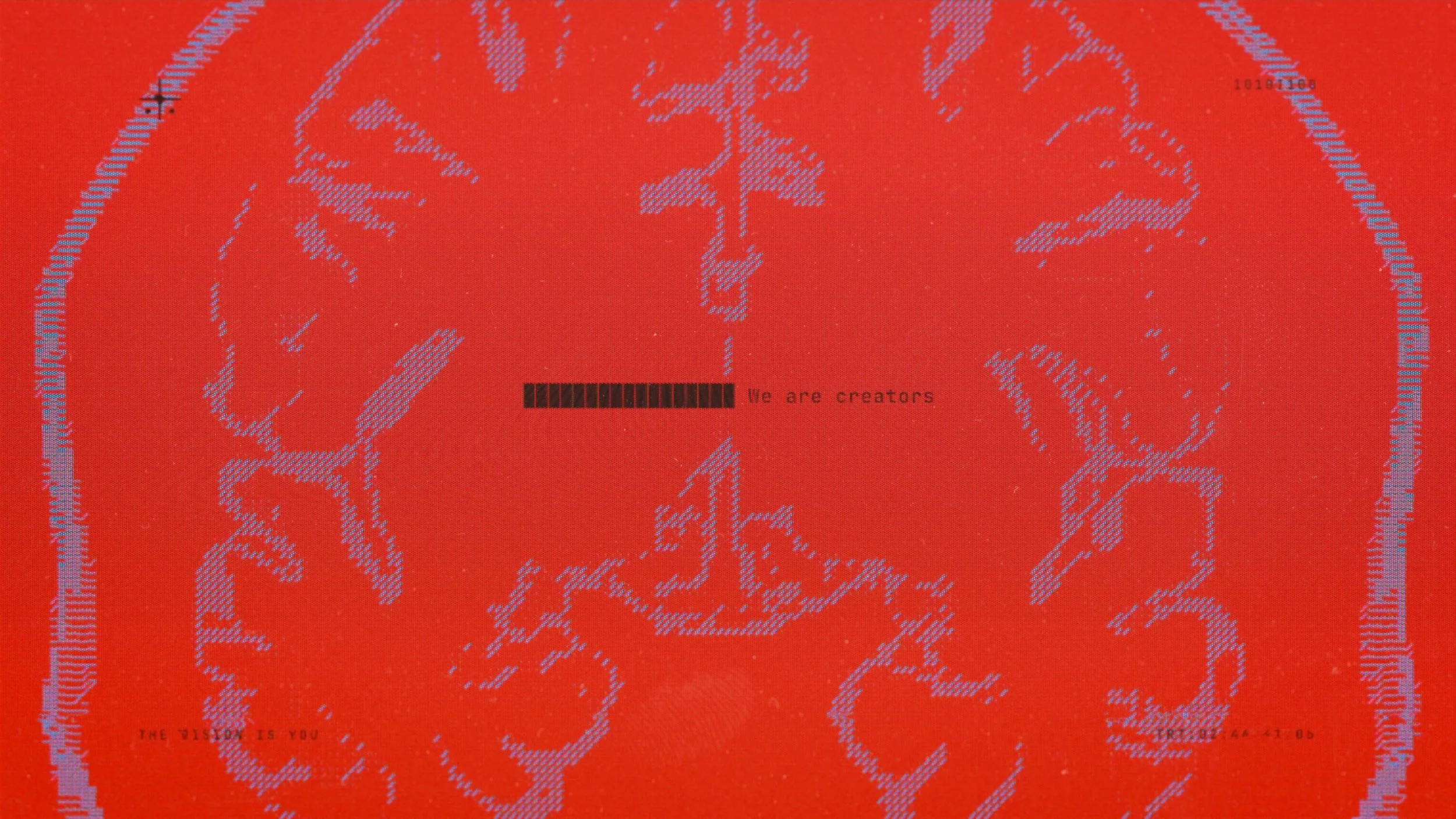
ASCII
ASCII wasn't just a texture choice — it was a functional one. The terminal aesthetic fit the brand's secretive voice perfectly: raw, coded, and slightly forbidden. But the real opportunity was interactivity. By embedding ASCII directly into the website, the brand could become something visitors actually touched and manipulated, turning a visual language into an experience. The hacker terminal look made the brand feel like a system you were breaking into, not a logo you were looking at.
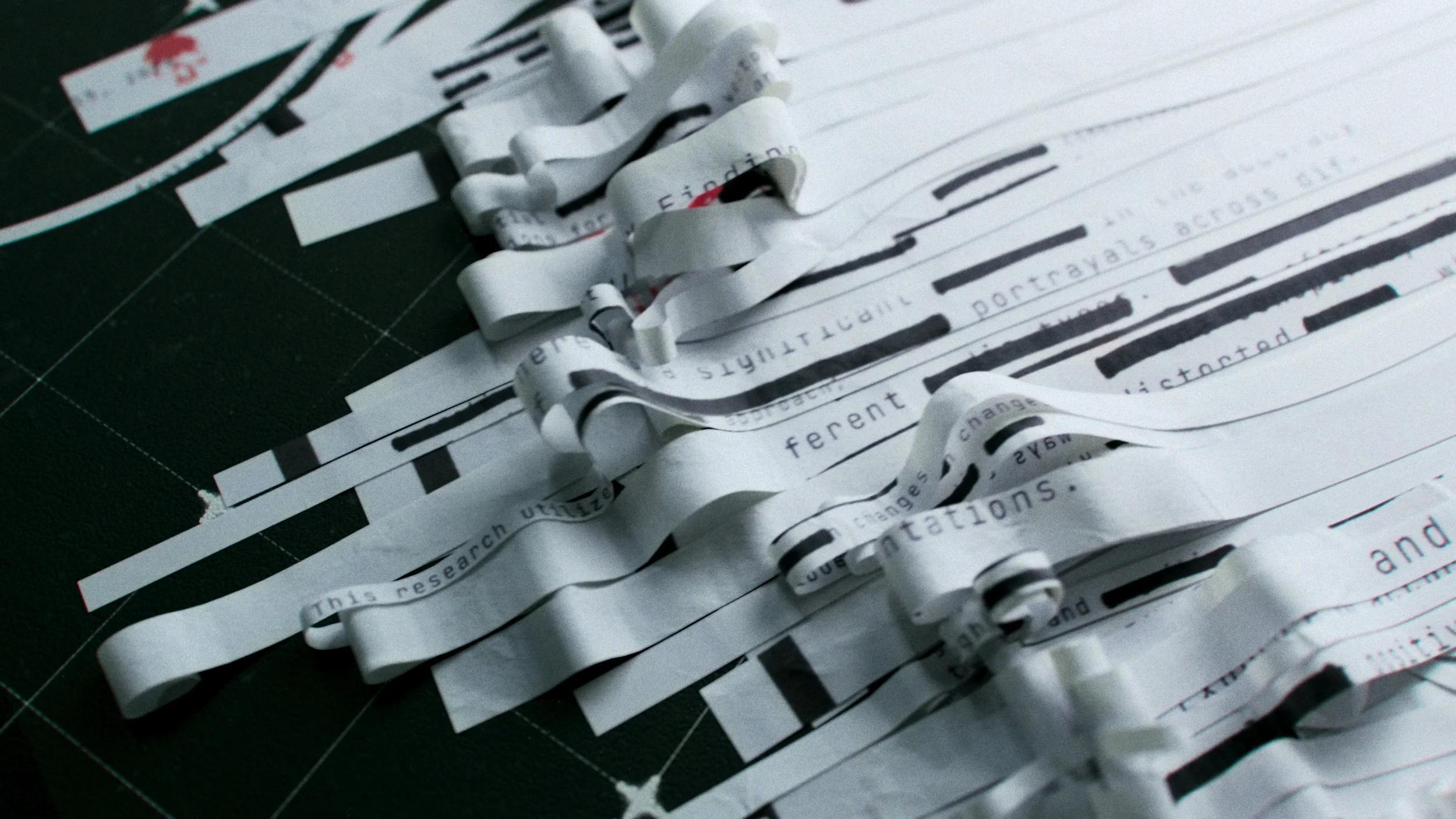
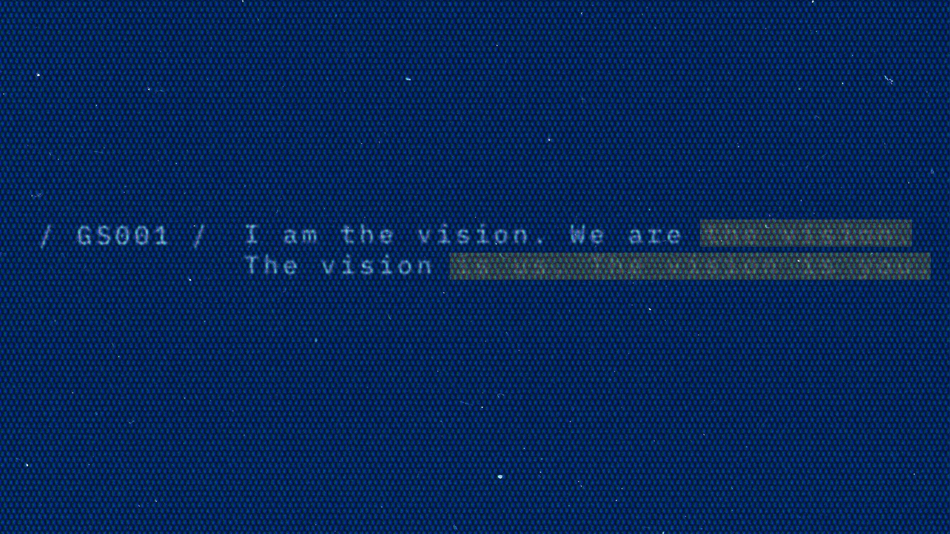
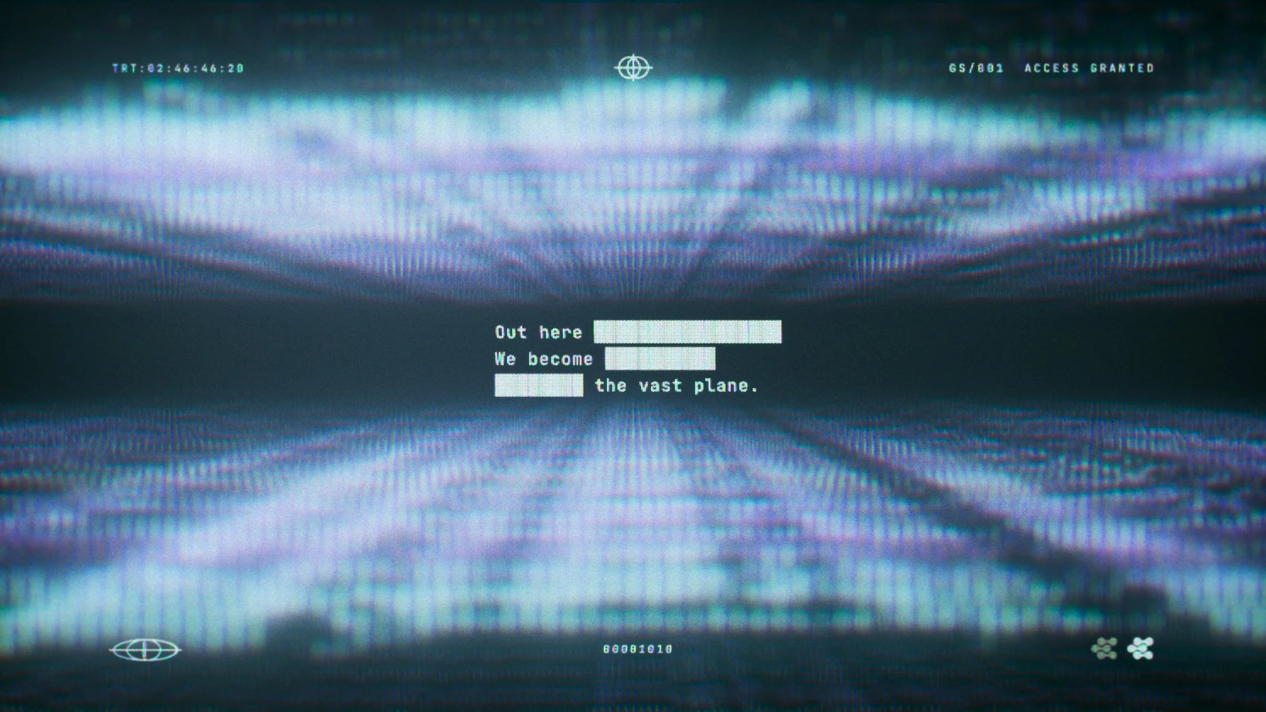
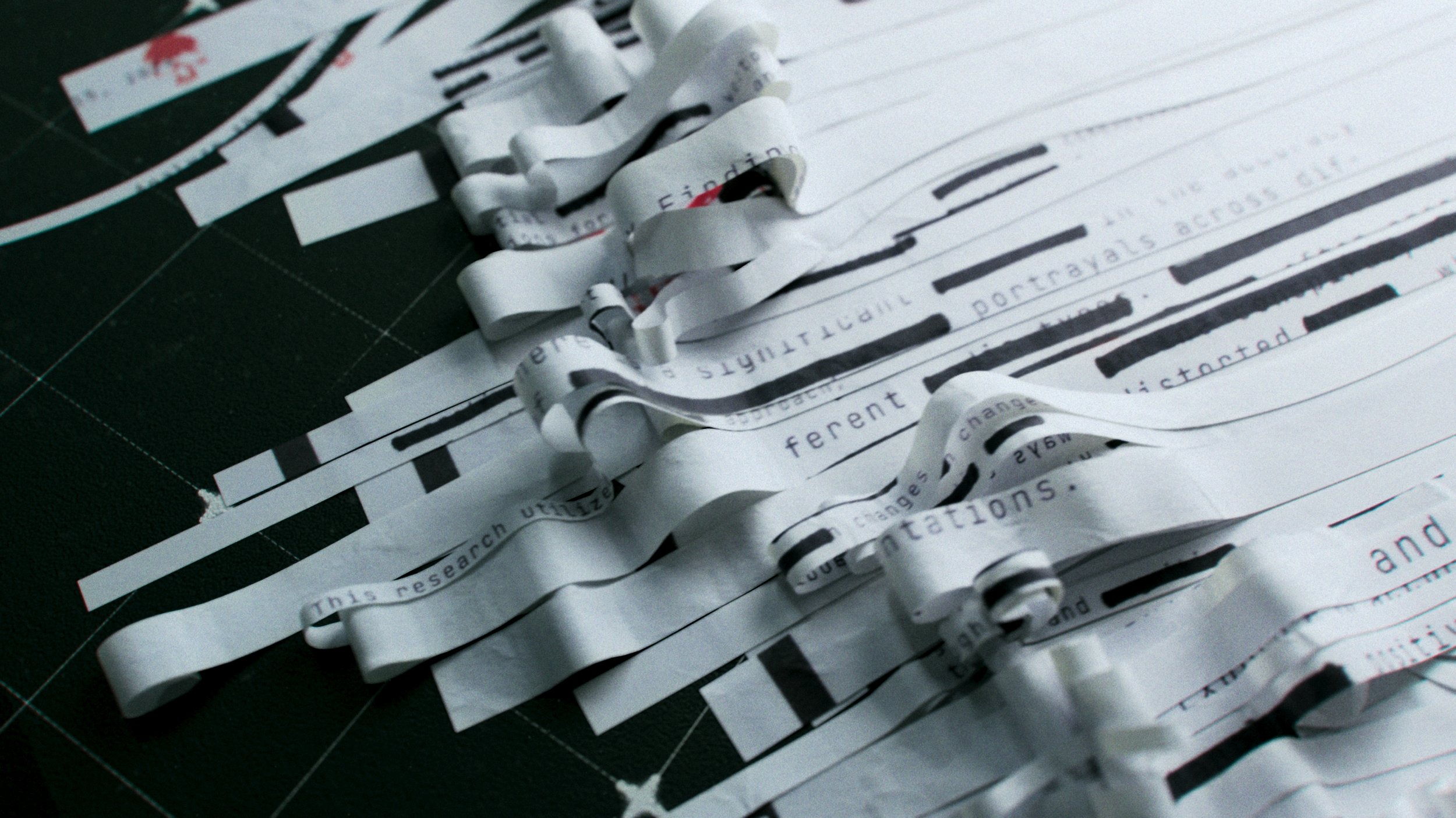
Redaction
We came across alot of really cool looks in the research and development phase. We loved the voice that redacted text gave the brand. The redaction system was a deliberate brand voice decision: Giant Skull speaks like a signal from the future, selectively revealing and concealing. Every blacked-out line reinforces the idea that there's a world forming beneath the surface — one the studio will slowly let you into over time.

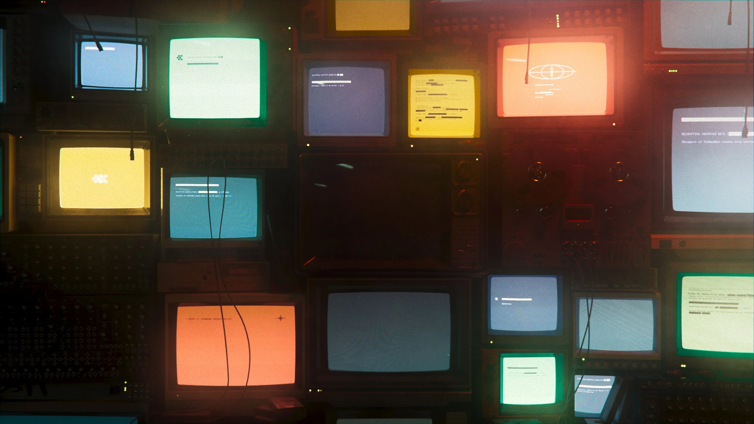
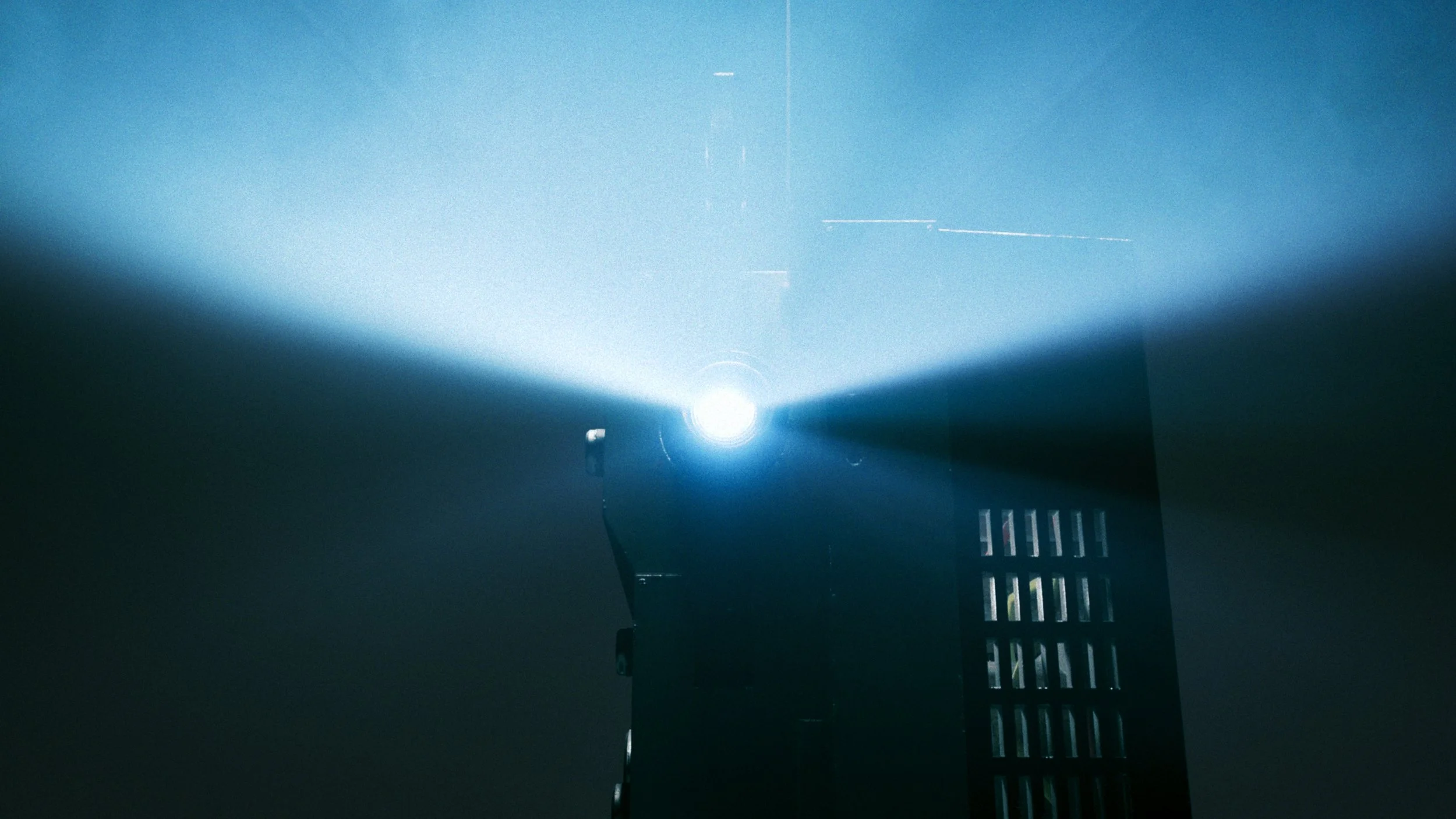
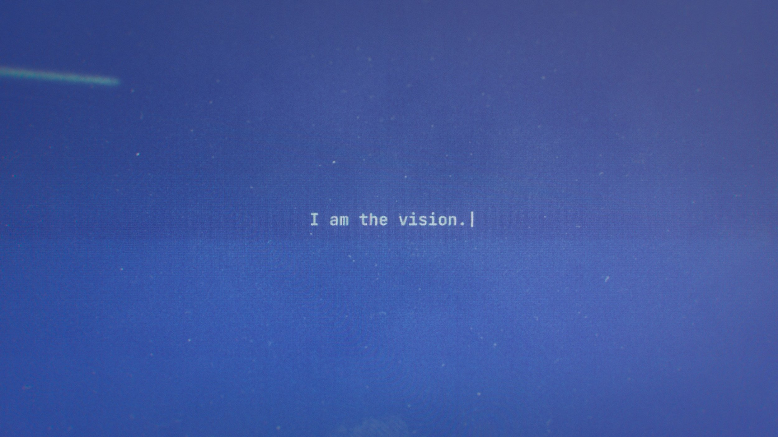
Narrative
The website wasn't an afterthought — it was the final act of the brand story. Built around a functional terminal interface, the site invited visitors to dig deeper, uncovering hidden easter eggs and encrypted messages about upcoming projects. The same secretive voice that ran through the identity system had a place to live and breathe, turning a brand launch into something people actually wanted to explore.
Result
A brand is only as strong as what it can support. Giant Skull secured funding to build out their team and announced a partnership with Wizards of the Coast — and the identity system was built to carry all of it. Every decision, from the redacted type to the ASCII terminal, was made with longevity in mind. This is what it looks like when a full brand system — strategy, design, motion, and interactive experience — is led with intention from day one.